One day my friend asked me

WHAT’S GOOD
DESIGN FOR YOU?

so my thought went to a story I had heard when I was a student. This is the story of the best design ever of the best designer ever.

ONCE UPON
A TIME

"What is good design ?"
Somebody must have asked the same question, several years ago, even to Bruno Munari, the myth of Italian design of the 60s. What followed was a booklet of a few pages that impeccably described the project which, according to Munari, represented one of the best industrial design products made by the best designer in history: Nature. This is what he tells us.
Keep down-scrolling to animate doodles
1

ANATOMY
OF AN ORANGE

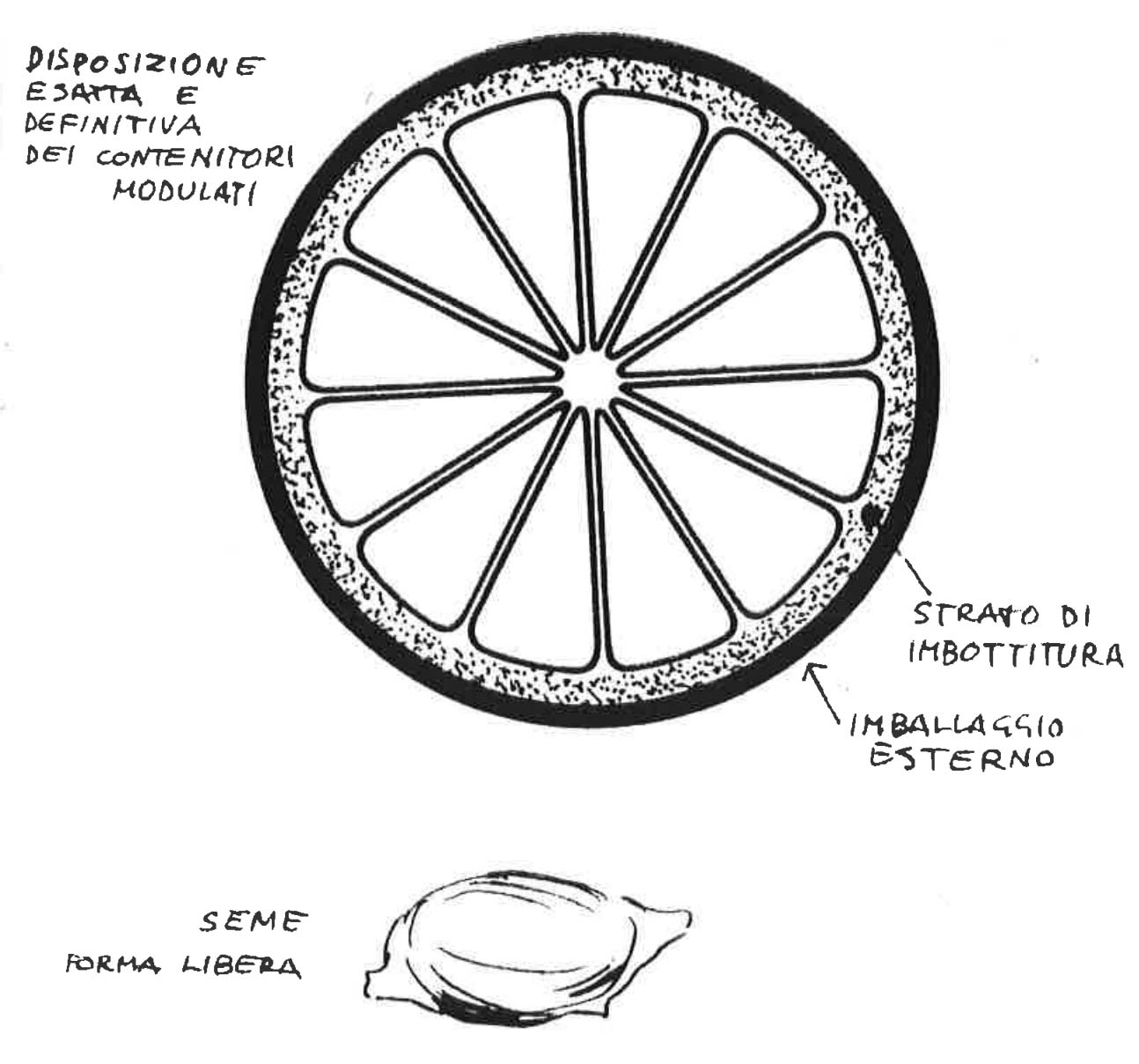
This object is constituted of a series of modulated containers in the form of an orange section placed in a circle around a central vertical axis on which each section rests on its straight side, with all the cur­ved sides turned towards the outside, giving the whole a global form, a kind of sphere.
2

PACKAGING
OF AN ORANGE

All the sections are gathered together in a packing that is well differenciated in material and colour. It is quite hard on the outside sur­face and covered with a soft inner lining of protection that lies between the outside and the ensemble of the containers. The original material is of the same type but is suitably different according to its use.
3

EASY
TO OPEN

To open the packing is very simple and so it is not necessary to attach printed instruction for use. The lining layer is also to create a neutral zone between the outside surface and the containers, so that when breaking the surface at any point, without any need of calculating its exact thickness, it is possible to open the packing and take the con­tainers out intact.
4

A VIABLE
MODEL

Each container itself is formed of a plastic film just large enough to hold the juice, but of course, easy to handle. A very weak adhesive holds the sections together so that it is easy to take the object apàrt into its various egual sections. As it is being used today, the packing is not made to return to the manufacturer but can be recycled and become a compost soil itself.
5

A CLEVER
SHAPE

Something must be said here on the form of the sections. Each sec­tion has exactly the form of a dental plate of a human mouth so that once lifted from the packing it can be put between the teeth and using a slight pressure, break it and drink the juice. Speaking of this, tangerines can be considered as a kind of minor side­ production especially suitable for children because of their smaller sec­tion.
6

A FAIR
OBJECT

Besides the juice, the sections usually contain a small seed from the same tree. This is a little gift that the production offers to the con­sumer just in case he should wish to have his own personal produc­tion of these objects. Please note the economie unselfishness of such an idea, and at the same time the physcological bond that is born between the consumer and production.
7

A PERFECT
DESIGN

An orange, therefore, is a perfect object, in which the absolute cohe­rence of form, use, consumption is found. Even the color is exactly right. It is a typical object of a real mass production on an international level in which the absence of any symbolic of expressive element bound to the fashion of styling or industrial aesthetics or any reference to sophisticated figurativity, demonstrate a design consciousness that is extremely hard to find on the average level of designers.
8

THE K
MODEL

A few years earlier, Kandinsky, a Bauhaus researcher and teacher, even aimed to determine the properties of the form's essential elements with the purpose to found a rigorous science of art. For him, the form, natural or artificial, was the signifying manifestation of the reality, it was a tension of forces, and could only be understood in relation to its invisible background, its hidden nature. (Point and Line to Plane - 1926 - W. Kandinsky)

CONCLUSION
& RESOURCES

This reflection is inspired by the Bruno Munaris's book "Good Design", published for the first time in 1963 by Scheiwiller Editore. The idea was born from the desire to pay homage to a character who has inspired dozens of designers all over the world, starting with myself. The magic of Munari's work is to know how to speak through the universal language of fantasy. In fact, his publications are mostly dedicated (and inspired) to children, their clear imagination and their ability to marvel. "With a circle, a line, a square and a triangle - he said - anyone is able to represent the world". The intelligence of Nature is hidden within the simplest forms we know, so designers have the task of removing any unnecessary and disturbing elements. To see the simplest forms within the more complex ones. To find the most basic signs in the structures that surround us. Today we hear more and more often about "atomic system", meaning a design process that involves the constitution, first of all, of the basic elements of the system and gradually more complex ones (small-first), like a living organism, which grows, changes and adapts itself to the external environment, thus becoming the effective structure of the cultural fabric. What's "good design" then? Maybe only intelligence made visible.